Fluid is MyCashflow's latest default theme. Its appearance, structure, and functions can be easily and comprehensively customized directly within the online store's admin panel.
- Modern and clear design – designed to be customer-oriented and user-friendly.
- Active development – new features are frequently added to the theme, and its functionality is regularly tested.
- Highly customizable – you can customize the theme's appearance and features by using theme settings available directly in the admin panel, without having to deal with HTML/CSS code.
- Comprehensive compatibility – Fluid supports all major web browsers and devices.
Banner areas in the Fluid theme
The Fluid theme includes several predefined banner areas. Below you will find information about the properties and usage of the default theme banners.
See also the instructions for managing banners.
The banner text will be displayed either in black or white, depending on which color is better distinguished from the overall color of the image in the background. The background image should be relatively flat in color.
If there is no background image, the text color is determined by the background color of the banner area.
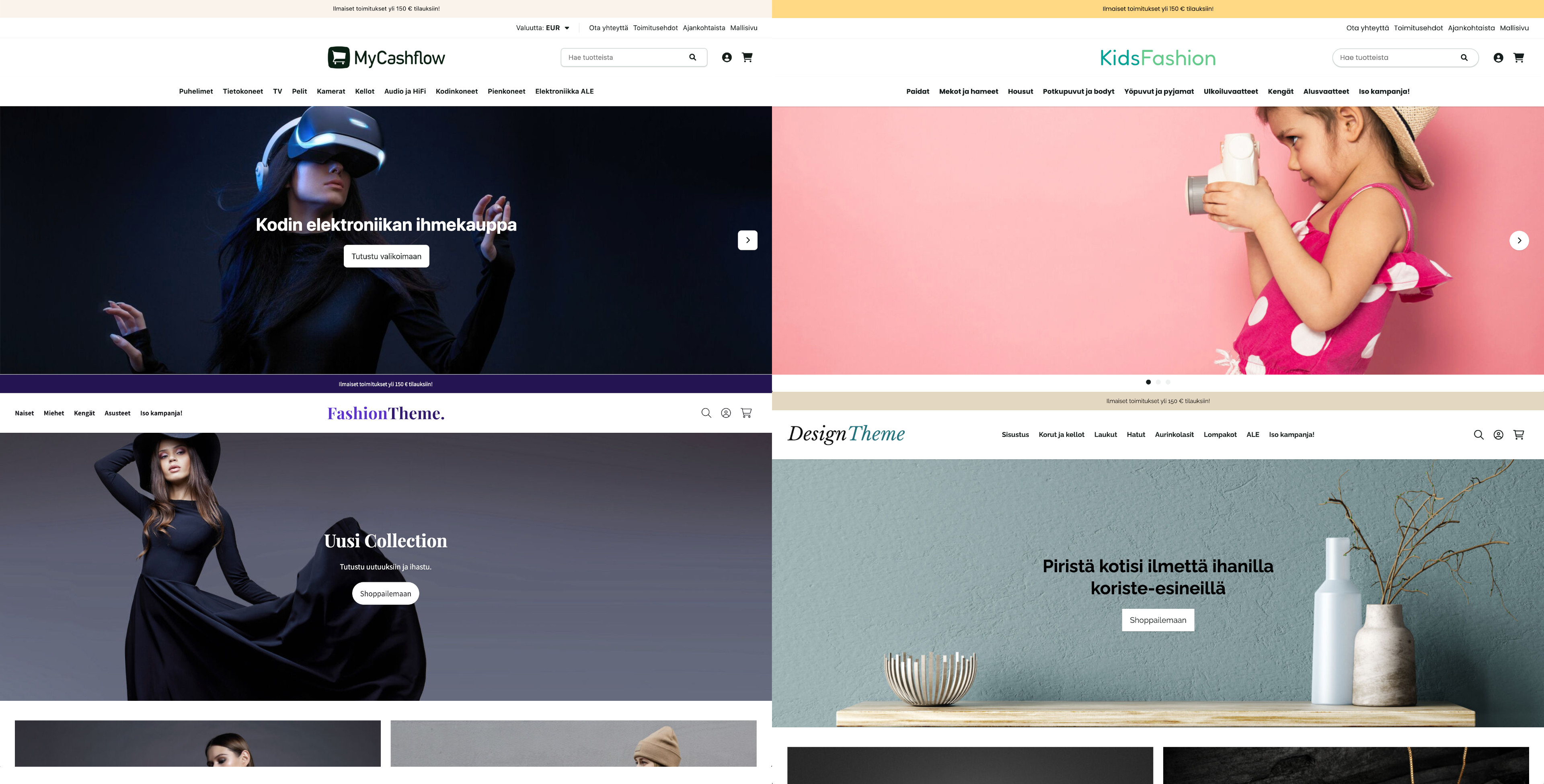
Front page main banner
At the top of Fluid's homepage is a banner carousel, which includes the first 4 banners from the group frontpage-main. The visitor can browse them using the carousel buttons, but under the Fluid theme settings section you can also set the banner to change automatically every few seconds.
The banner's title and text are located in the center of the image.
- Location in online store: front page
- Banner group code: frontpage-main
- Recommended image size and aspect ratio for background image: 2000*700 px / 1:0.35 (in mobile view, the image is cropped from both sides, and the aspect ratio is 2:1)
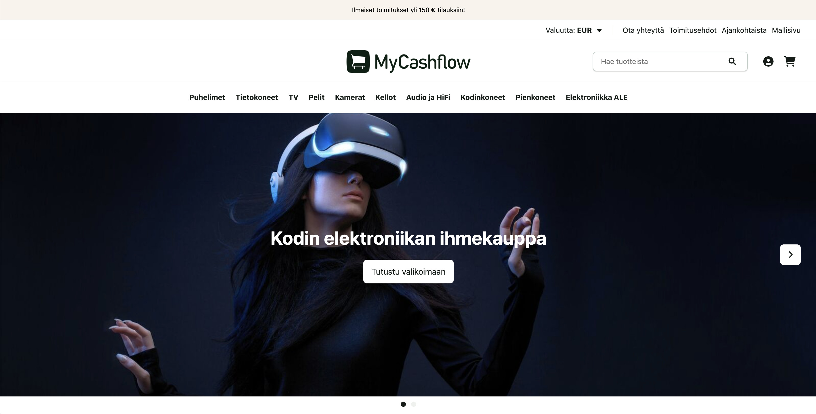
Front page highlights
At the most, the first 3 banners from the frontpage-featured group are displayed below the front page banner carousel. The banners can be used, for example, to promote popular products, campaigns, or brands on the front page.
The width of banners is either 50% or 33% (depending on how many there are). The banner's title and text are positioned in the lower left corner of the image.
- Location in online store: under the main banners on the front page
- Banner group code: frontpage-featured
- Recommended image size and aspect ratio for background image: 1000x640 px / 1:0.64
Page top notice bar
At the top of each page there is a text-based notification bar showing the first banner of the group notification-bar. The notification bar may contain a short notice, for example, on a topical topic and, if necessary, a link to additional information.
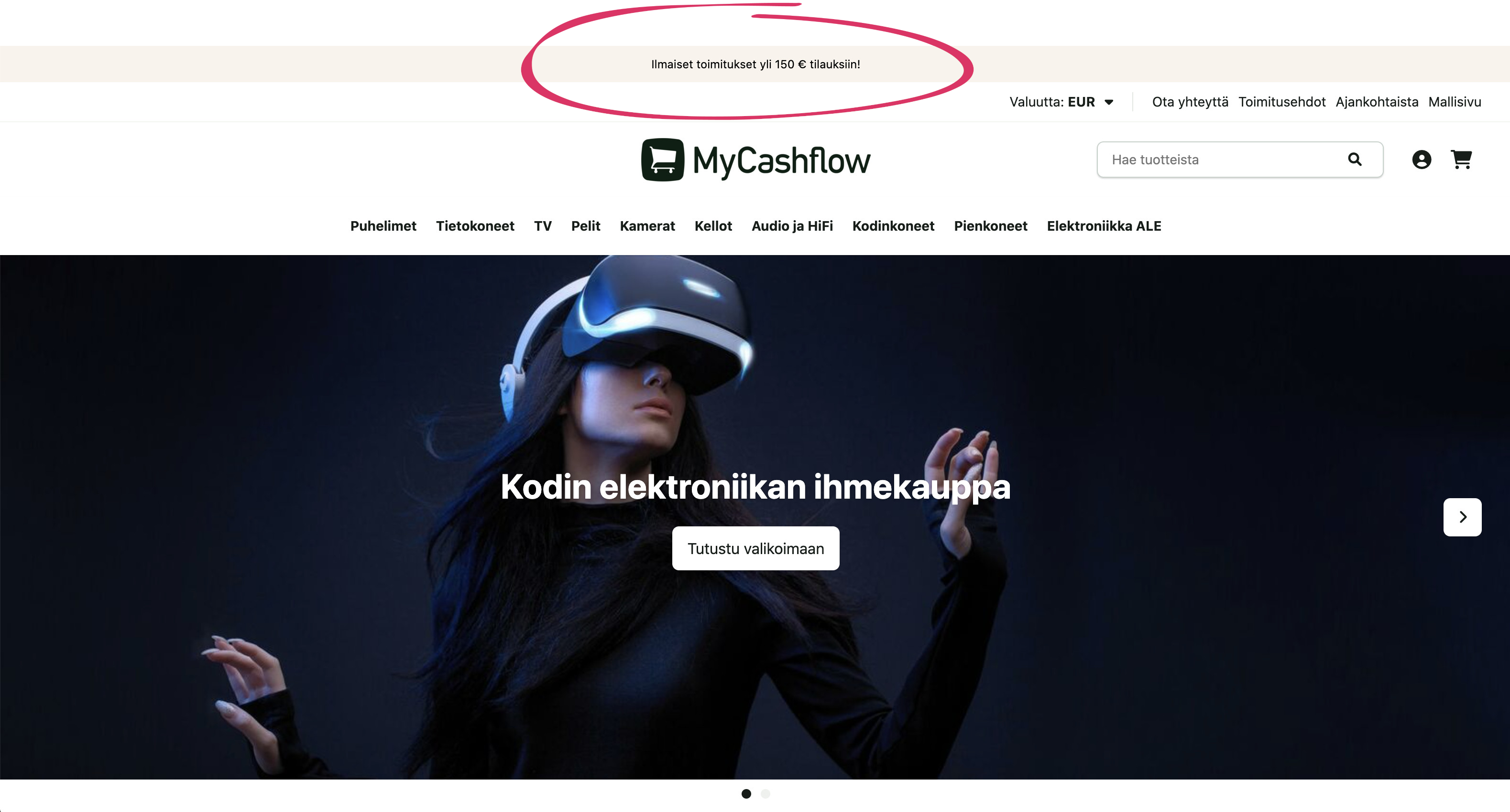
- Location in online store: at the top of all pages
- Banner group code: notification-bar
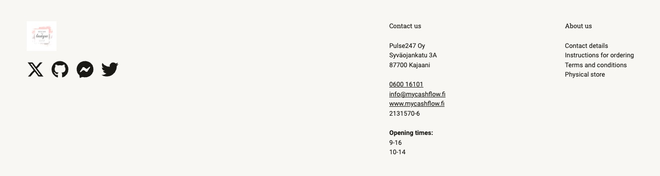
Social media buttons
The store's footer contains a banner area for social media links that belong to the banner group social-media-buttons. Each banner shows an icon or link text representing the linked service.

- Discord (https://discord.com/invite/KOODI)
- Facebook (https://www.facebook.com/NIMI)
- Facebook Messenger (http://m.me/NAME)
- GitHub (https://github.com/NIMI)
- Instagram (https://instagram.com/NIMI)
- LinkedIn (https://www.linkedin.com/company/NAME)
- Pinterest (https://www.pinterest.com/NAME)
- TikTok (https://www.tiktok.com/@NAME)
- WhatsApp (https://www.whatsapp.com/channel/CODE)
- X (https://x.com/NIMI)
- YouTube (https://www.youtube.com/channel/CODE)
- In the banner settings itemName, type the name of an icon found in the Font Awesome library and add the prefix fa (for example, a truck icon can be configured by setting the name to fa-truck). In this case, use only small letters in the name.
This configuration method does not work with the Font Awesome library's brand icons.
- Under banner settings, select an image file from your device as the icon in the Banner field.
If there is no icon, Fluid displays the banner name as the link text.
The color of the icons directly supported by Fluid and Font Awesome automatically adjusts to the footer background color that you can specify in the Fluid theme settings under .
- Location in online store: footer
- Banner group code: social-media-buttons
- Recommended image size and aspect ratio for your own icon: 280x280 px / 1:1
Footer contact information
- Company (business name)
- Street address
- Location (postal code and office)
- Phone
- Internet (store's URL for marketing)
- Business ID
If you want the same information to appear in the contact banner, add the {ContactInformation} tag to the banner settings fieldText. Alternatively, you can add the information you want row-by-row. You can also indicate the opening hours of the store in the banner.
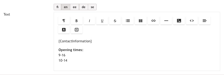
Unlike other banners, the contact banner appears in the online store based on the banner's own code rather than the code of the banner group.
- Location in online store: footer section on all pages except for the checkout
- Banner code: contact-information
Newsletter subscription form
Above the footer is a banner area for a newsletter banner, which belongs to the newsletter group. The banner contains an order form for the e-commerce newsletter.
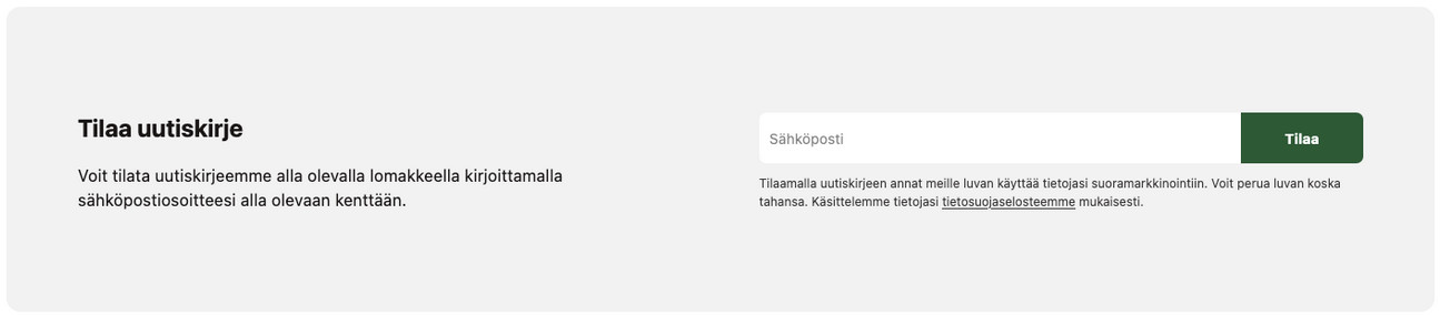
You can create store version-specific banners with their own backgrounds as well as texts that differ from the default texts in the dictionary. In the online store, only first newsletter banner is displayed.
In order for the newsletter banner to appear in the online store, it must be activated both in the banner’s own version visibility settings and in the Fluid theme settings under .
- Location in online store: above the footer
- Banner group code: newsletter
- Recommended image size and aspect ratio for backgroud image: 1400x400 px; background should work regardless of image ratio, as it adapts to different display modes (on computer display size is normally 1400x300 px but narrower if necessary, while on mobile devices height is 400 px and width may be similar)
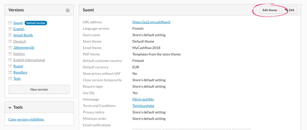
Fluid theme settings
You can customize the appearance, structure, and functions of Fluid by using the theme settings in the admin panel.
To edit the theme settings, select a version using Fluid from the admin panel page and press .
The theme editing view includes a preview of the online store and settings menus on the left side. With the preview, you can see in real-time how the settings you modify affect the appearance of the online store on different devices (desktop, tablet, or phone). The changes will take effect when you press the button at the top of the page.
Below, we go through the the Fluid theme's setting menus:
Colors
To define the color, enter the hexadecimal color code in the text field or press the box in front of the text field and select a shade from the gradient palette.
- Highlights: Specifies, for example, the background color of buttons and the highlight color of links.
- Header background color: Defines the background color of the main navigation.
- Footer background color: Specifies the background color of the footer.
- Notification bar background color: Specifies the background color of the top banner.
Style settings
- Edge rounding: Specifies, for example, the rounding of corners of form fields and product images.
- Action button rounding: Specifies the rounding of corners for buttons.
- Icon library style: Determines the thickness of icons. The Fluid theme incorporates the Font Awesome icon library.
Fonts
- Font size: Sets the base level for the font size of all texts (small, medium, or large).
- Title font: Specifies the font for headings. A predefined collection of Google Fonts service fonts is available.
- Title weight: Specifies the font weight for headings.
- Title style: Specifies whether headings use both uppercase and lowercase letters or only uppercase letters.
- Body text font: Defines the font of normal text.
Top menus
- Show language menu: Adds a menu to the page header that allows the visitor to change the language of the online store. The menu displays all public versions of the online store.
- Show currency menu: Adds a menu to the page header that allows the visitor to convert price information to their desired currency. The setting only works if the Currency Converter extension is installed in the online store.
- Show content pages in header: Adds the top-level content pages of the online store to the page header.
- Language menu style: Specifies whether the language menu should display the version names or their language codes (e.g. FI).
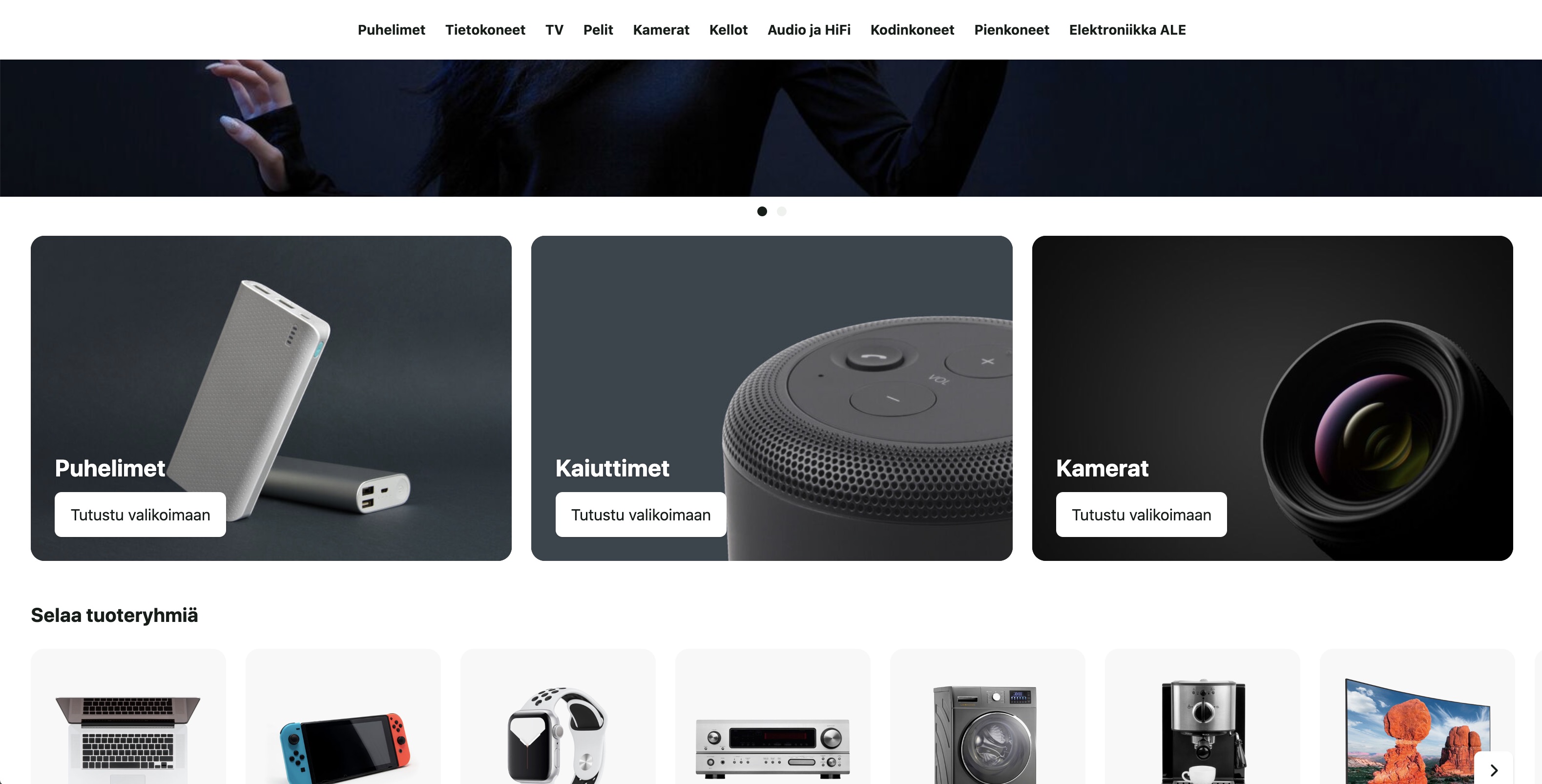
Front page
- Banner carousel slide autorotation: Determines whether the frontpage banner carousel image changes and at what pace (5–7 seconds is often a suitable display time for a banner without much text).
- Display the front page introduction text: Adds an introduction text and a campaign image to the frontpage, which must be specified in the homepage product category form items Description and Campaign image.
- Show featured categories: Adds to the frontpage a list of product categories that are marked as featured in the Featured category item of the product category form.
- Show featured products: Adds to the frontpage a list of products that have the Featured product option activated in the product form.
- Show top sellers: Adds a list of the store's best-selling products to the front page.
- Show new products: Adds to the frontpage a list of products that have most recently been added to the online store.
Product category
- Category image layout: Specifies the location of the product category image on the page. Set the product category image in the product category form's Campaign image section.
- Category image height: Specifies the height of the product category image.
- Category menu layout: Determines the location of the subcategory menu on the page.
Product list
- Product list item size: Determines the width of the product on product lists.
- Product list item style: Determines the appearance of the product on product lists. You can choose from ready-made presets.
- Product image aspect ratio: Determines the aspect ratio of the product image on product lists.
- Allow adding products to cart from product lists: Adds a shopping cart button to product thumbnails on product lists.
- Show brand: Adds the brand name to product thumbnails on product lists.
- Availability: Specifies whether the product's stock availability or balance is displayed on product lists.
Product page
- Variation menu style: Specifies how the variation menu should be presented on the product page (with radio buttons or a dropdown menu).
- Show brand: Adds the brand name to the product page.
- Display the shipping costs table: Adds a shipping costs table to the product page.
- Display quantity selector: Adds a quantity selector to the product page.
- Display stock balance: Adds the exact stock balance of the product or variation to the product page.
Wish lists
- Display wish list: Enables the wishlist feature in the online store.
Email Marketing
- Display the newsletter banner: Adds a newsletter subscription form to the site footer.